THE CASE
Duolingo is an app that teaches users to speak, write and read different languages through short lessons. Thus, users are not bound to a certain curriculum, physical lesson, or a specific teacher, meaning that Duolingo is readily available to anyone who wants to learn a new language or refresh one they are already acquainted with, as long as they have a smartphone. Duolingo claim to be "Universally accessible". However, this claim does not take into account parameters of digital accessibility. Do all potential users have digital accessibility? As a part of my Inclusive Design course, I decided to take a look at Duolingo's accessibility with a help of the WCAG standards.

THE GOOD
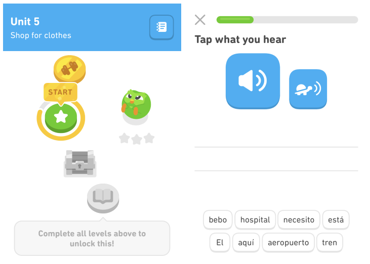
Duolingo is great at getting across information to its users. There is a consistent design implemented
throughout the entire application and the different sections of lessons are clearly marked, indicating what
users are to learn. Users are also given feedback when they do something wrong, like trying to begin a lesson
that has yet to be
unlocked.
Nothing in the app needs to be controlled by holding, or dragging and dropping. The only aspect which
might be physically challenging for certain people, for instance, users with motor impairments, is that if a
user wishes to go back and repeat an old lesson, this possibility is only available with scroll.
All
sound bits are recorded in-studio, without background noise, which is positive, not least because random
sounds can be distracting for people with certain neurocognitive conditions and may cause them trouble in
distinguishing speech from other audio.
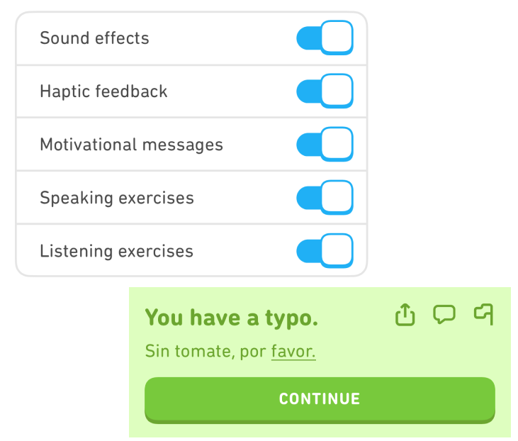
I went to the settings on the app to see if there was anything users could change, in order to customise their
experience with the app. There were some settings that could benefit certain users, for example: speaking
exercises can be switched off, for non-verbal users, and listening exercises can be switched off for deaf or
hearing-impaired users. Haptic feedback can also be turned on or off, which can be either very helpful or very
distracting, depending on who is using the app. Letting users themselves choose what works best for them is a
nice touch. Unfortunately, Duolingo has yet to add an option for disabling animation in the settings.
Since the app is based on gamification, users lose a heart when a mistake is made. This could make things
rough for dyslexic users when writing exercises appear. Duolingo counters this by letting users make small
typos. They also recommend users to add the language that is being studied to the keyboard of their phones, so
that autocorrect can help for certain exercises.
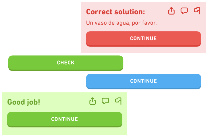
Another good thing that Duolingo does really well is to make users feel that they are in control. There are no time constraints on exercises, except for the leaderboard challenges, which are bonus exercises and not part of the main lessons. Every exercise that a user completes is controlled by either clicking "check", to correct the exercise, or "continue", to advance in the lesson. When the exercise is complete, a user can choose to press the speech bubble to see a discussion board featuring other users' feedback, including various tips and tricks.
THE BAD
So, what does the Duolingo app do that isn't that great? Well, none of the text in the entire app is scalable
with a user's phone text size, meaning that reading smaller texts might be difficult for users who rely on
application usage with scalable fonts. Also, the app does not have a landscape orientation, so users who
navigate their phones in landscape mode are limited to portrait mode. The navigation bar of the app shows some
icons, with no supporting text, which makes it hard for users to fully grasp what the different sections do.
The podcast-function of the app, unfortunately, does not provide audio transcriptions, which means that deaf
and hard of hearing users cannot access that entire section of the app in the same way other users can. And,
speaking of audio, the soundbites that are in listening exercises, are played automatically. It is not
possible to pause them, something that does not accord with WCAG standards. However, users can replay them as
many times as they want, and most clips are just a few seconds long.
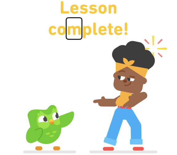
A very worrying aspect with Duolingo is how a screenreader works with it. A screenreader is usually the main tool for persons with impaired vision. If a screenreader cannot function properly, then all users with impaired vision are excluded from using the app. A lot of the elements and units are completely broken in the homepage and in the lessons for the screenreader. Some words cannot be focused on separately, making lessons much harder because users cannot access direct translations of words. The screenreader will speak simultaneously with an exercise's audio, creating a medley of audio mess. There is no way to bypass this, even after the initial happenstance. It occurs every time. None of the pictures have image alt text applied to them, meaning that images with superimposed text are being completely disregarded by the screenreader, which of course is not supposed to happen. There is also no difference between the "Speak text aloud"-button and the button that speaks the exercise's audio slowly, which makes this feature hard for certain users to even be aware that it exists. Even the "Lesson complete!" screen is so broken that it reads every letter on its own.
AND THE UGLY
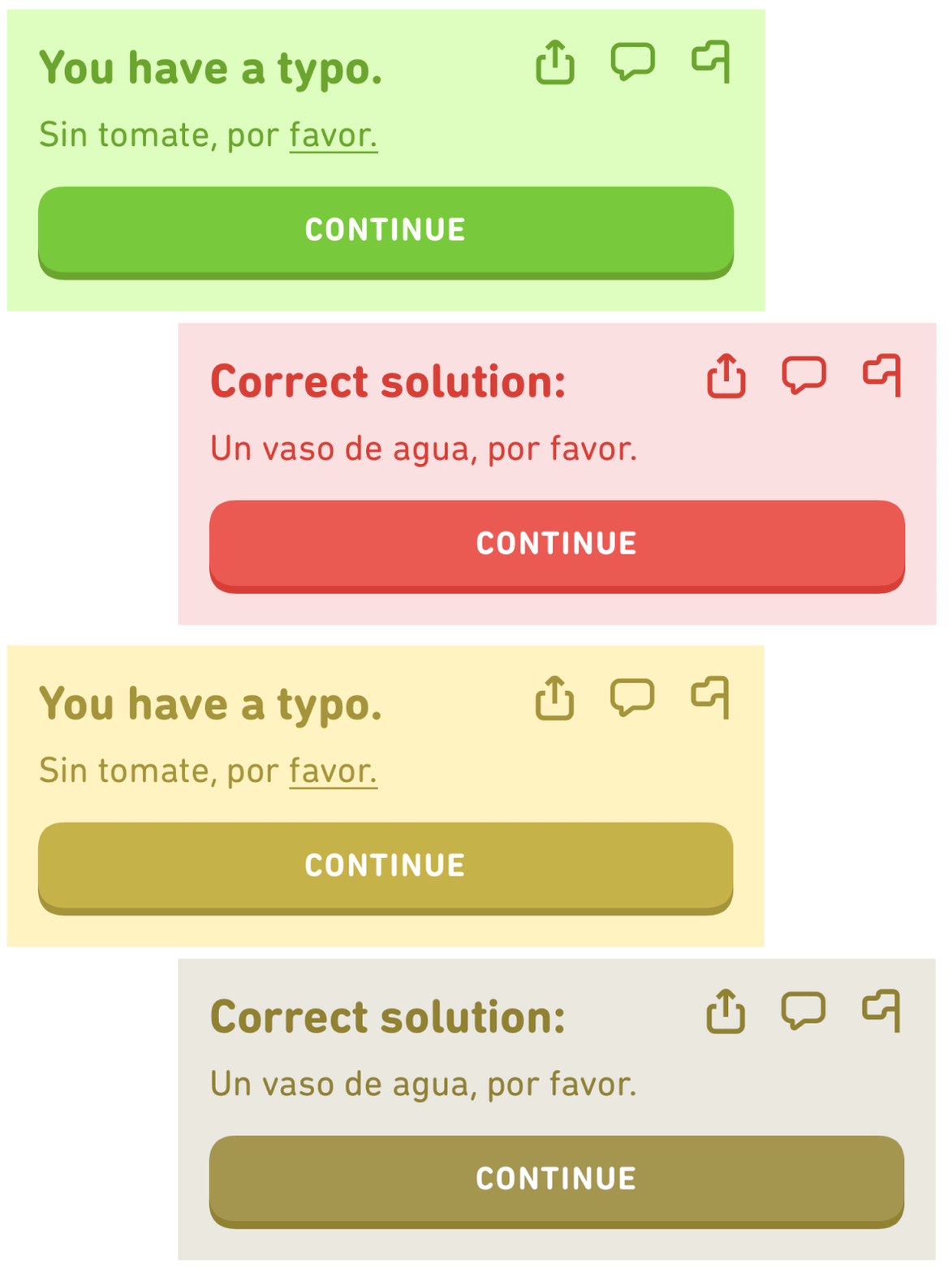
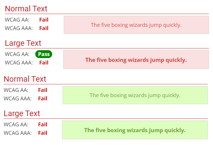
Contrast is something that Duolingo, without a doubt, could improve. While certain texts in the app pass the WCAG contrast threshold, others do not. The confirmation textbox that comes up after an exercise is complete does not pass. Duolingo has put red and green texts on similar looking backgrounds, only to achieve a contrast of 3.6:1 and 2.7:1, when, in order to pass WCAG standard AA, it needs to be at least 4.5:1 for smaller texts, and AAA requires 7:1. If a user has deuteranomaly (red-green blindness), which is fairly common for men, the two textboxes are almost identical when a simulated filter of deuteranomaly is placed on top of them. That might make it hard for some people to quickly figure out if they passed the exercise, since they have to rely on the text to see if the answer was in fact correct or not.
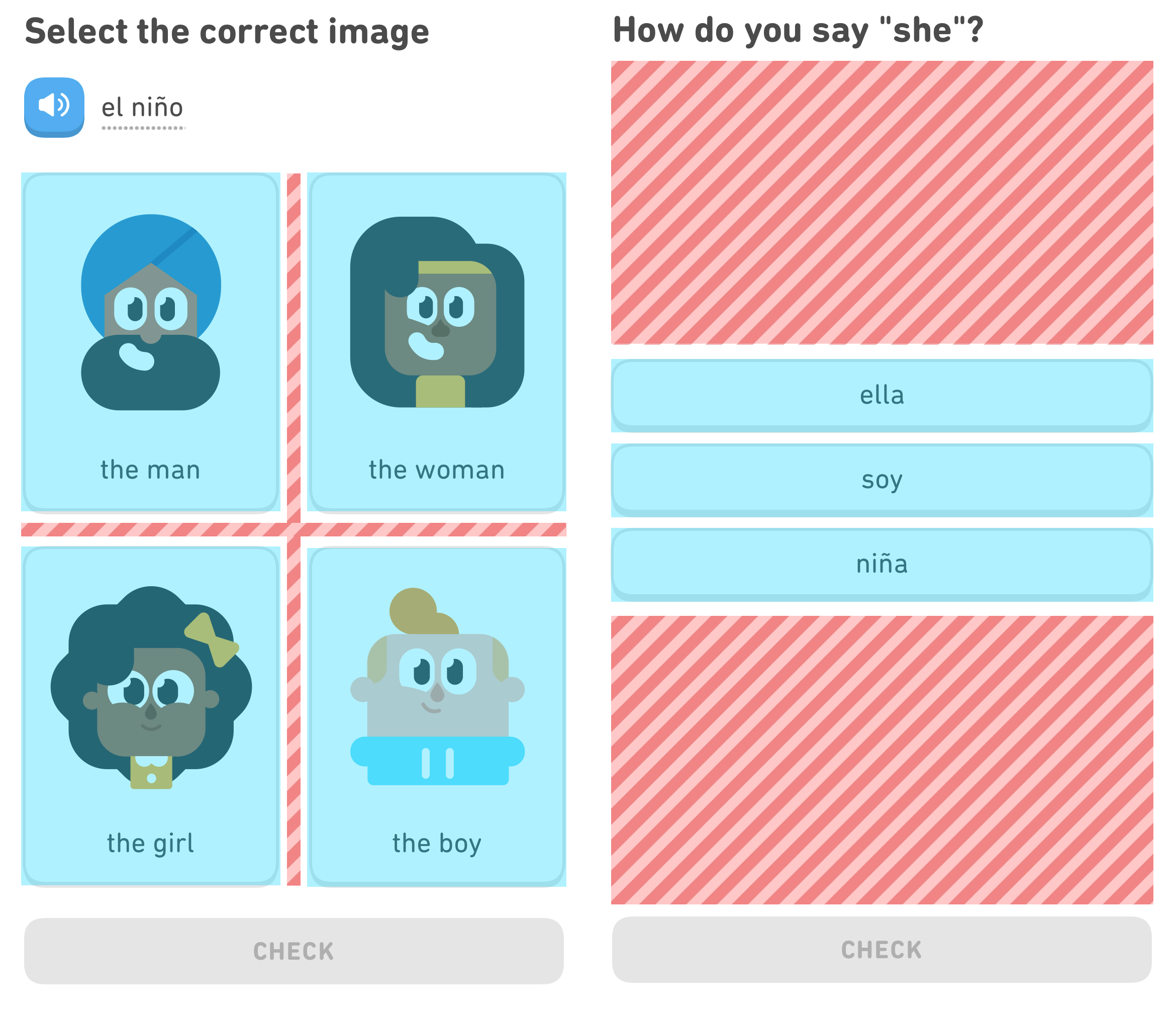
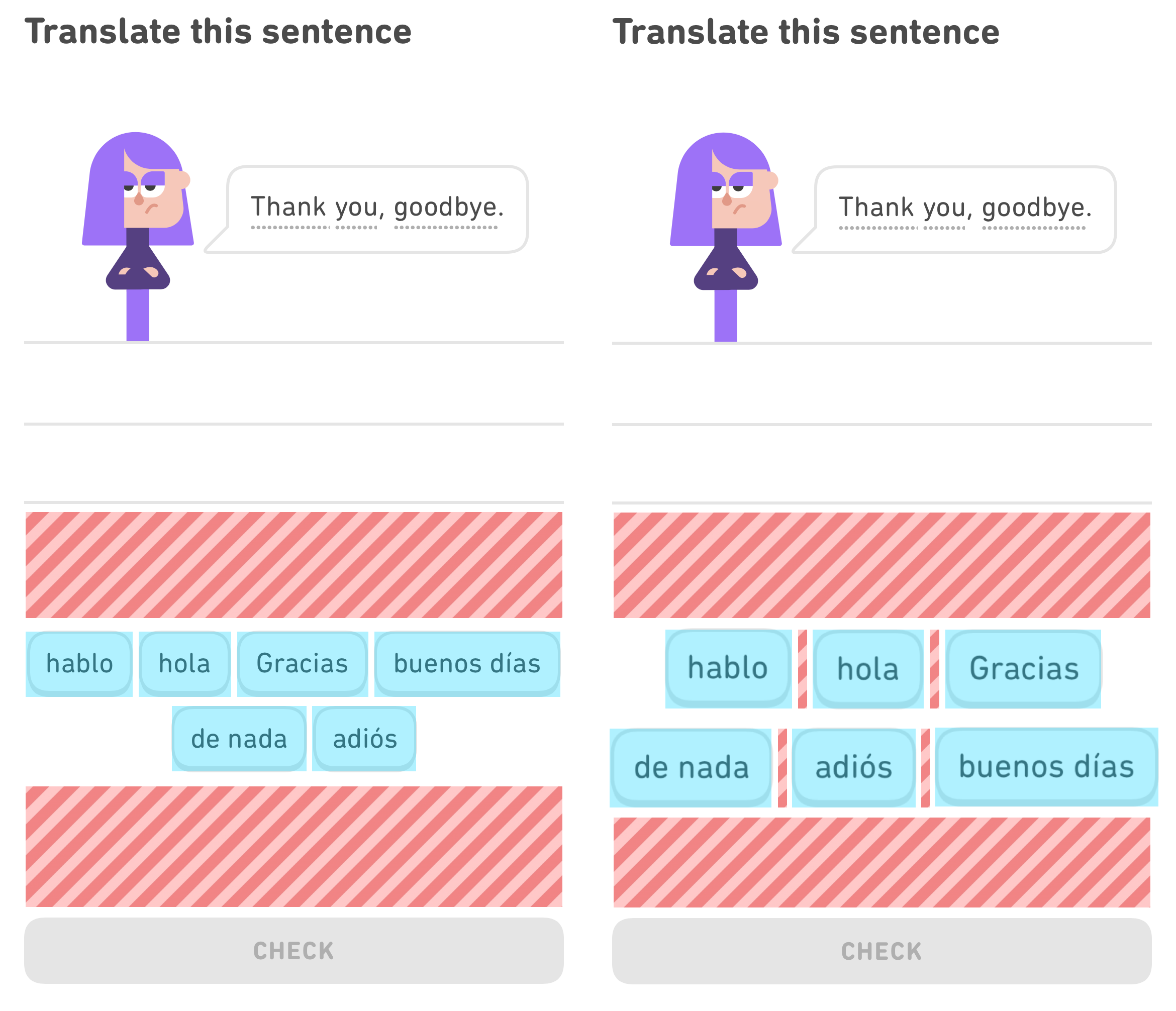
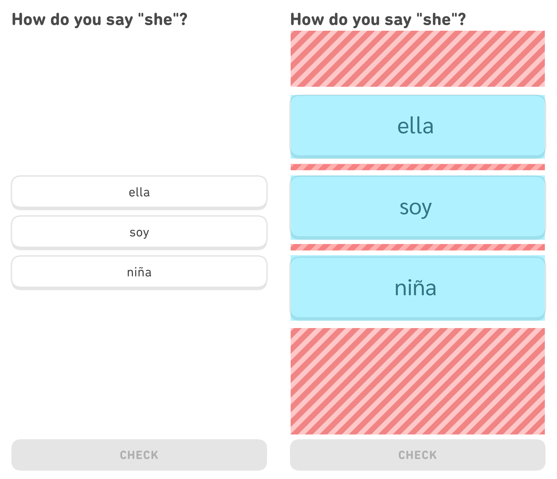
Duolingo is not consistent at all when it comes to clickable surfaces. Some exercises are great and have big
areas for the fingers, and some exercises are bad and have tiny areas for the fingers. The blue areas indicate
the clickable surface, and the red-striped areas indicate the non-clickable whitespace. There is a lot of
whitespace unused. This could be better planned.
Having tiny clickable areas in an app is not only difficult for people with motor impairments but makes it
easy for anyone to slip up and press the wrong thing. Nielsen Norman Group recommends at least a 1x1 cm
surface on handheld devices, and Duolingo definitely does not reach that standard.
MY IMPROVEMENTS
So, what are some improvements that could be made? First and foremost; nothing should be broken to the point where some users cannot properly use the app. An example is the screen reader. All features should be accessible to all users. While Duolingo is great at communicating, it would be better if the different units could be found in a list somewhere in the app, so no scrolling would have to be required to access old lessons. I also believe that some of the texts used in the lessons are not actually text-elements, but pictures and/or buttons, since they do not scale with the phone's font size. That should not be the case.
For the more visual improvements, clickable surfaces could definitely get a once-over. It is pretty easy to just scale everything up in order to make better use of unused whitespace. I made two variants, one that is a little more on-brand to Duolingo, which still is an improvement in the clickable surface area, albeit small, and one that has a much larger clickable surface area. The original size of Duolingo is to the left and my more accessible version is on the right.
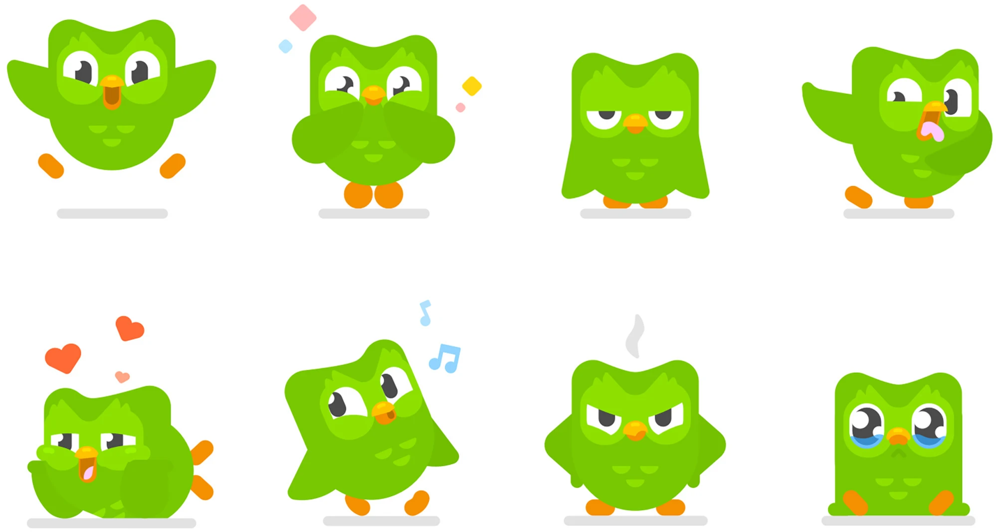
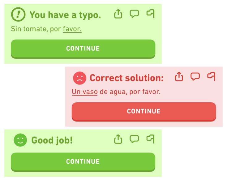
Something else that could make the overall experience when using the app would be to add a better feedback system. Despite Duolingo being quite direct when giving feedback, when marking an exercise as right or wrong, it could be improved. Right now, Duolingo has different sound cues that indicate a right or wrong answer, which is great. However, since the right and wrong textboxes are in fact red and green, as stated before, these could pose a problem for certain users having deuteranomaly (red-green blindness). To counter this, Duolingo could either increase the contrast, to make the two colours more discernable and add a colourblind option in the settings, or, add another layer of clarity, not just for the colorblind. Duolingo could add, for example, a happy face when an exercise is done correctly, and a sad face when done incorrectly, to really drive home to users whether what just happened was good, or bad.
CONCLUSION
While certain issues might take a longer time to correct, in the end, it is my opinion that such improvements would immensely increase the overall user experience of the app. If I got to really deep dive into making Duolingo a more accessible app, I would go through once more thoroughly with the WCAG standards and rank each flaw with either an Impact-Effort Matrix or a MoSCoW analysis. Then the problems to prioritise would be revealed. This assignment ignited my interest for inclusive design in the digital world, and I would love to be able to work with improving everyone's experience online.